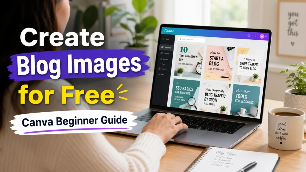
This article helps beginners learn how to create blog images for free using Canva with practical, step-by-step instructions and real experience.
Introduction: I Thought Blog Images Were Not Important
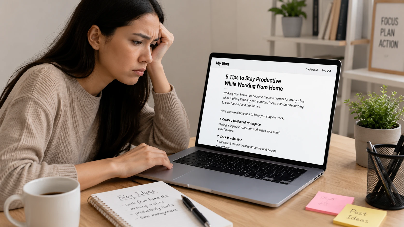
When I first started blogging, I made a mistake that a lot of beginners make. I focused only on writing. In my mind, if the content was valuable, people would read it. That was the only thing that mattered. I didn’t think much about design, layout, or visuals and blog images?
I completely ignored them. I used to think, “Why spend time creating images when people are here to read?” So I published post after post with little to no visuals. But something wasn’t working.
Even when I started getting visitors, they didn’t stay long. My blog looked plain, unpolished, and honestly… forgettable. When I compared my posts with other blogs, the difference was obvious. Their content looked clean, structured, and professional. Mine looked like a wall of text. That’s when I realized something important:
People don’t just read content—they experience it and visuals are a big part of that experience. So I decided to fix it. There was just one problem… I had zero design skills. I didn’t know how to choose colors, fonts, or layouts. And I definitely didn’t want to spend money on expensive design tools. That’s when I found Canva.
At first, Canva alone felt like a lifesaver. It made designing simple, even for someone like me who had no experience. But things got even better when I started using AI tools alongside it. Instead of struggling to come up with design ideas, titles, or layouts, I began using AI to:
- Generate blog image text ideas
- Create catchy headlines for thumbnails
- Suggest color combinations and styles
- Even generate unique images
Then I would take those ideas and bring them to life inside Canva: AI gave me direction and Canva helped me design. This combination completely changed my workflow. What used to take me hours of confusion became a simple, repeatable process.
Now, instead of skipping images, I actually enjoy creating them and the best part? You don’t need design skills for this. You don’t need expensive tools.
You just need:
- A simple AI tool for ideas
- And Canva to turn those ideas into visuals
If you’re just starting out, this combination can save you a lot of time and frustration and in this guide, I’ll show you exactly how to do it step by step.
What is Canva? (And How It Works with AI)
If you’ve never used Canva before, the simplest way to understand it is this. It’s a tool that turns design into something anyone can do. You don’t need technical skills. You don’t need to learn complicated software and you definitely don’t need a background in design.
When I first opened Canva, I expected it to be confusing but it wasn’t. Everything is drag-and-drop. You can click on elements, move things around, change text, switch colors—and see the result instantly. It feels more like playing than working. That’s what makes it perfect for beginners.
What You Can Create with Canva
As a blogger, Canva quickly became my go-to tool for almost everything visual.
I use it to create:
- Blog featured images
- Pinterest pins
- Social media graphics
- Infographics
- YouTube thumbnails
Instead of relying on different tools for different tasks, Canva puts everything in one place.
Where AI Makes Canva Even More Powerful
Earlier, the hardest part for me wasn’t designing—it was deciding what to design. What text should I use?, What style looks good?, What kind of image fits my topic?, etc. That’s where AI changed things.
Now, I use AI tools to: Generate blog image ideas, Write short, catchy titles, Suggest layouts or design directions, Create image concepts then I take those ideas into Canva and build the actual design. AI helps you think and Canva helps you create. This combination removes the “blank page” problem completely.
Why Blog Images Are Important
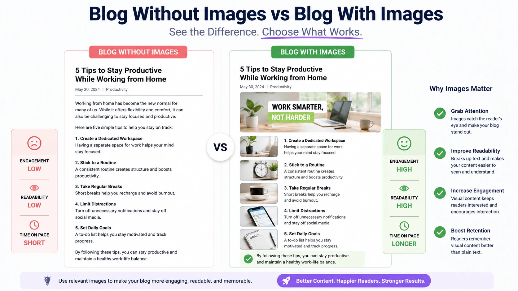
1. Images Make Content Attractive
This is the first thing I noticed when I started adding images to my blog. Before that, my posts looked like long, endless blocks of text. Even if the content was useful, it didn’t feel inviting. If I’m being honest, even I wouldn’t feel excited to read it. But once I started adding simple, clean images, everything changed.
The same content suddenly looked more organized and easier to read. Images naturally break up the text, giving the reader small pauses instead of overwhelming them with information. It also creates a better first impression.
When someone lands on your blog, they decide within seconds whether they want to stay or leave. A well-placed image can make your post feel more polished and professional right away.
I also realized that images help guide the reader’s attention. A good visual can highlight important sections and make your message clearer without adding more words. From my experience, you don’t need fancy designs.
Even simple images—if they’re clean and relevant—can make your content much more attractive and enjoyable to read.
2. Better Engagement
One of the biggest changes I noticed after adding images was how people interacted with my blog. Earlier, visitors would land on my post and leave within seconds. There was nothing visually holding their attention. But once I started using images, that behavior slowly changed. People began staying longer.
They scrolled more, paused between sections, and actually spent time reading. Images made the content feel less overwhelming and more comfortable to go through.
I realized that visuals don’t just “look good”—they keep readers engaged. Even simple section images can guide someone through your post and make them more likely to finish it.
3. Helps in SEO
At first, I didn’t connect images with SEO at all. But over time, I learned that they do play a role—just in a slightly indirect way.
When you add images with proper ALT text and meaningful file names, it helps search engines understand what your content is about. It gives extra context to your page. Also, better engagement (like longer time on page) can send positive signals to search engines.
Another small benefit is image search. If your images are optimized properly, they can show up in search results and bring in additional traffic. It’s not the main ranking factor, but it definitely supports your overall SEO strategy.
4. Useful for Pinterest Traffic
This was a complete game-changer for me. I didn’t realize how powerful images could be until I started focusing on Pinterest. Unlike Google, where text matters more, Pinterest is all about visuals. Your image is what decides whether someone clicks or scrolls past.
When I began creating clean, vertical pins using Canva, I started seeing real results. Some of my pins began getting impressions and clicks—even when my blog was still small.
That’s when it clicked for me: A good image can bring traffic even without a high-ranking blog.
Now, for every blog post, I create multiple Pinterest images. Because one good design can keep bringing traffic again and again.
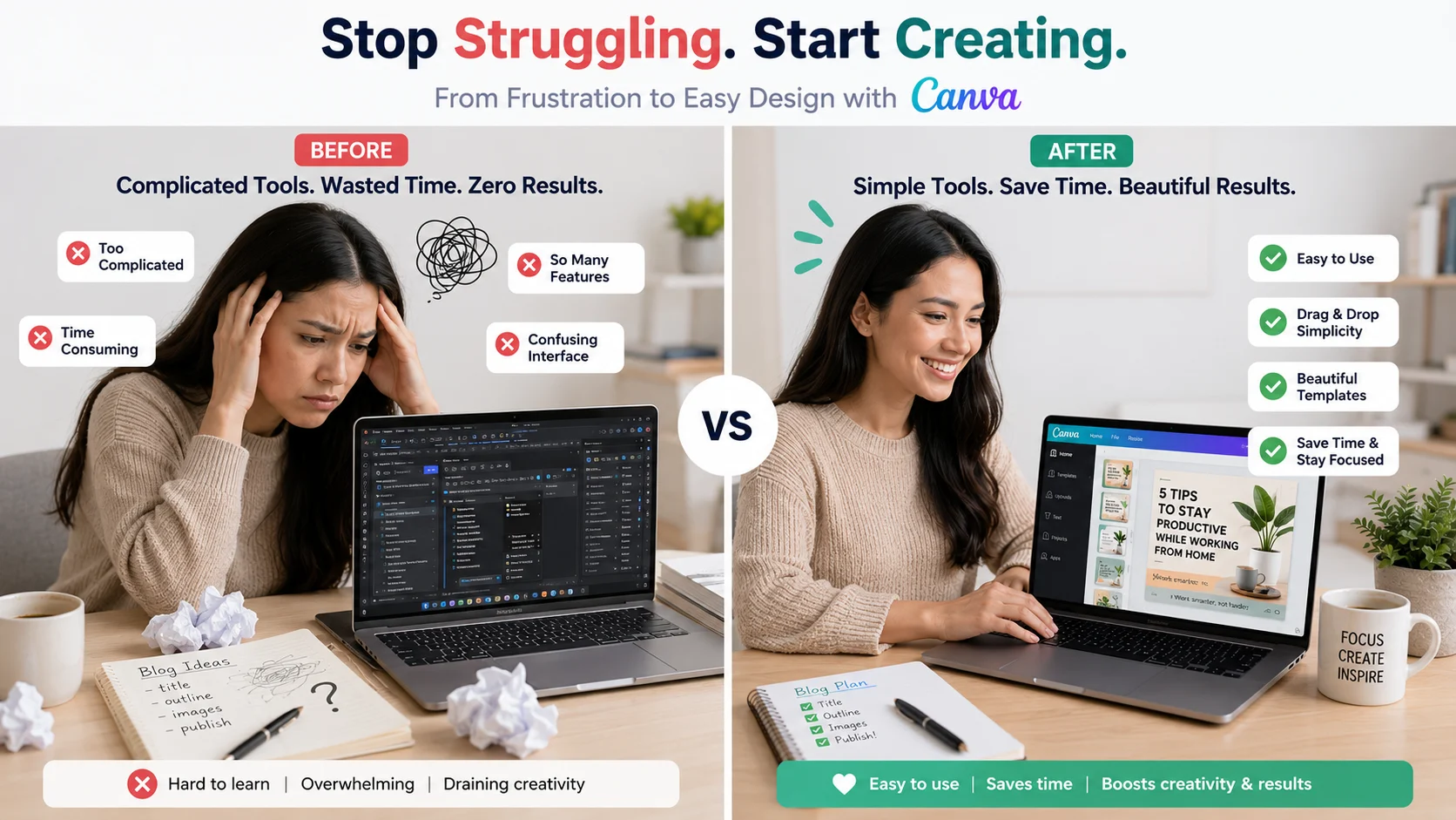
My Biggest Problem Before Canva
Before I started using Canva, creating blog images felt like a constant struggle. I didn’t have a clear process.
Most of the time, I would just search for random images online and try to use them in my posts. The problem was, they either didn’t match my content or looked low quality. Nothing felt consistent or professional. I also tried a few editing tools, thinking they would help. But instead, they made things worse.
They were complicated, full of features I didn’t understand, and took too much time for something that should be simple. I would spend 30–40 minutes just trying to adjust one image—and still not feel satisfied with the result. Because of that frustration, I often avoided adding images altogether.
Sometimes I would tell myself, “I’ll add images later.” But most of the time, that “later” never came. And deep down, I knew this was hurting my blog. My posts looked incomplete. They didn’t grab attention. And compared to other blogs, mine felt… average. The real problem wasn’t just lack of skill. It was lack of a simple system.
I needed something that didn’t require design knowledge, didn’t take hours to learn, and didn’t make the whole process feel like work. That’s exactly what I found when I started using Canva. It removed the confusion and made image creation feel easy for the first time.
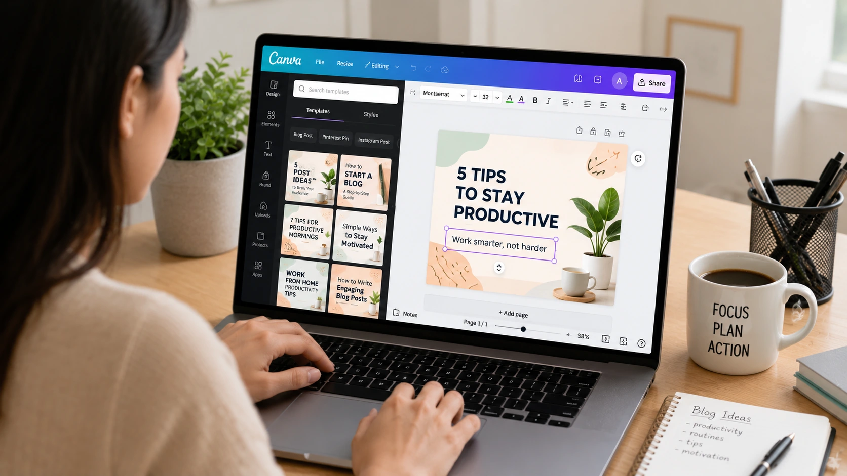
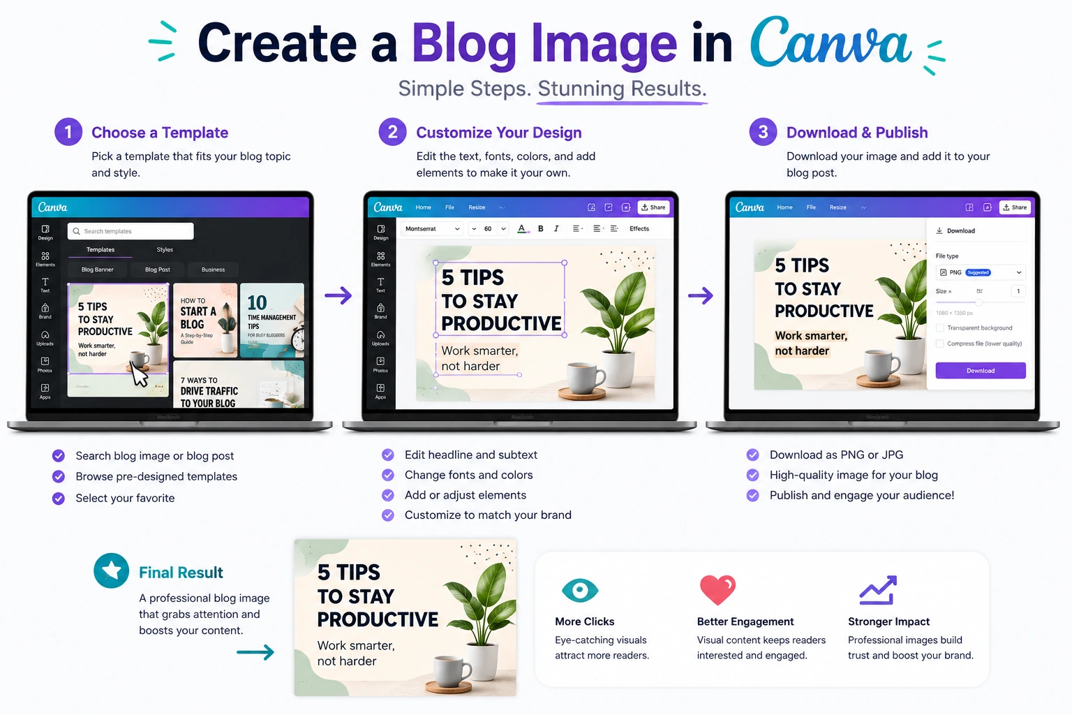
Step-by-Step Guide: How to Create Blog Images for Free Using Canva
When I first started using Canva, I used to overthink everything. What design should I choose?, Which colors look good?, Am I doing this the right way? Over time, I realized something simple:
You don’t need a perfect process. You just need a repeatable one. So here’s the exact step-by-step method I use now. It’s simple, beginner-friendly, and actually works.
Step 1: Create Your Free Canva Account
Start by signing up on Canva. You can use your email or Google account, and it takes just a couple of minutes. Once you’re inside, you’ll see a clean dashboard where you can start designing immediately.
No complicated setup. No learning curve.
Step 2: Decide What You Want to Create
Before opening a blank design, be clear about your goal.
Ask yourself:
- Is this a blog featured image?
- A Pinterest pin?
- Or a social media graphic?
This step matters because each type of image has a different size and purpose.
When I skip this step, I usually end up redesigning everything later.
Step 3: Set the Right Dimensions
Now choose the correct size.
For example:
- Blog featured image → 1200 × 628
- Pinterest pin → 1000 × 1500
Using the right dimensions from the start saves time and makes your design look more professional.
Step 4: Use AI for Ideas (Optional but Powerful)
This is something I didn’t do in the beginning—but now I use it all the time.
If you’re stuck, use AI to generate:
- Short image text (titles)
- Design ideas
- Color suggestions
- Layout inspiration
For example, you can ask AI: “Give me 5 short titles for a blog image about Pinterest traffic.”
Then pick the best one and move forward. This removes confusion and gives you a clear direction before you even start designing.
Step 5: Choose a Template or Start Simple
Inside Canva, you’ll find thousands of templates. In the beginning, I highly recommend using them.
Search for something like:
- “Blog banner”
- “Pinterest pin”
Pick a clean and simple design—don’t go for something overly complex. If you prefer, you can also start from a blank canvas. Just keep your layout simple.
Step 6: Add Clear, Readable Text
Your text is the most important part of your image. This is what people will read first.
Here’s what works for me:
- Keep it short (3–6 words if possible)
- Use big, bold fonts
- Focus on the main idea
Instead of writing full sentences, I use phrases like: “Blog Traffic Tips” and “Beginner Guide”.
Simple text gets more attention and is easier to read—especially on mobile.
Step 7: Pick 2–3 Clean Colors
Earlier, I made the mistake of using too many colors.
Now I keep it simple:
- Choose 2–3 colors max
- Make sure there is strong contrast
For example, dark text on a light background works really well. Consistency in colors also helps build your blog’s identity over time.
Step 8: Add Elements (But Don’t Overdo It)
Canva gives you access to icons, shapes, and design elements. They can make your image look better—but only if used carefully. In my early designs, I used too many elements, and everything looked messy.
Now I follow this rule:
If it doesn’t add value, don’t add it.
Keep your design clean and focused.
Step 9: Use Relevant, High-Quality Images
If your design includes a photo, make sure it actually matches your topic.
For example:
- Blogging → laptop or workspace
- Growth → charts or graphs
- Productivity → desk setup
Avoid random images just to “fill space.” Relevant visuals make your design feel more meaningful and professional.
Step 10: Download and Optimize
Once your design is ready, download it properly.
I usually choose: PNG or WebP format (Webp Convert tool)
Also, make sure the file size is not too large. A heavy image can slow down your website, which affects user experience and SEO.
My Simple Workflow (What I Actually Do)
Over time, my process became very quick.
Now it looks like this:
- Get idea from AI
- Open Canva
- Pick template or layout
- Add short text
- Adjust colors and elements
- Download and use
That’s it. No overthinking. No complicated steps.
If you follow this process, you’ll be able to create clean, professional blog images—even if you’re a complete beginner.
My Personal Canva Design Style (Simple but Effective)
When I first started designing in Canva, I made things way more complicated than they needed to be. I thought good design meant adding more—more colors, more elements, more effects. But the result?
Messy, confusing images that didn’t really stand out. Over time, I realized something that completely changed how I design: Simple designs perform better.
Especially for blogs and platforms like Pinterest, clarity matters more than creativity. So I slowly developed my own style—and it’s very minimal.
I usually stick to:
- A clean, simple background
- One bold, clear title
- Very limited elements (sometimes none at all)
- Strong contrast so text is easy to read
That’s it. No fancy graphics. No overdesign. Just clean and focused visuals. I also try to keep my designs consistent. Using the same colors, similar fonts, and a familiar layout helps people recognize my content over time. It builds a subtle brand identity without extra effort.
Another thing I’ve learned is If someone can’t understand your image in 2 seconds, it’s too complicated. Now, before finalizing any design, I quickly look at it and ask: “Is this easy to read? Is this clear?”
If the answer is yes, I’m done. If not, I simplify it further. From my experience, you don’t need to be creative—you need to be clear and once you follow that approach, designing becomes faster, easier, and much more effective.
Types of Blog Images I Create
When I started blogging, I used to think one image per post was enough. I would just create a single featured image and move on. But as I got more serious about blogging, I realized something important.
Different platforms need different types of visuals, and each one plays a different role in your growth. Now, whenever I write a blog post, I don’t think in terms of “one image.” I think in terms of a small visual system.
Using Canva, I’ve built a simple workflow where I create a few specific types of images for every article. Each one has a clear purpose.
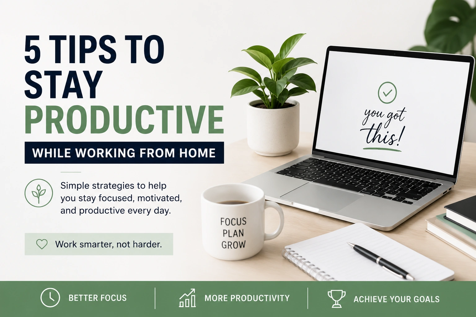
1. Featured Image
This is the main identity of your blog post. It’s the image people see first—on your blog homepage, Google results, or when the post is shared anywhere. And honestly, it quietly decides whether someone clicks or ignores your content.
I treat it like a book cover. If the cover is weak, people don’t even open the book. So I keep featured images clean and bold: One strong message, Big readable title, Simple background, Minimal distractions
I don’t try to overdesign it anymore. I focus on clarity. Because in blogging, first impressions are not optional—they are everything.
2. Pinterest Pins
This is one of the most powerful traffic sources I discovered later. Pinterest is not like Google—it’s not about ranking first, it’s about getting attention in a crowded feed. So your image is your marketing.
For every blog post, I usually create multiple Pinterest pins because:
- Different designs attract different users
- Testing helps you understand what performs better
- One good pin can keep bringing traffic for months
My approach is simple, I take the same blog idea and create 3–5 variations with different. Titles, Fonts, Colors anf Layout styles. Some pins fail. Some perform average. But occasionally, one pin takes off—and that alone makes the effort worth it.
3. Section Images
These are the most underrated images in blogging. Most people only focus on featured images and Pinterest pins, but section images improve something even more important is readability.
When someone opens a blog post, long paragraphs can feel overwhelming. Even if the content is good, the brain gets tired quickly. Section images fix that problem. They act like visual pauses inside your content.
I use them to:
- Break long text blocks
- Introduce new sections
- Reinforce key points
- Make the reading experience smoother
They don’t need to be fancy. In fact, the simpler they are, the better they work. Sometimes even a basic icon + text layout is enough.
4. Social Media Graphics
Once a blog post is published, I don’t just leave it there. I repurpose it. Social media graphics are my way of turning one blog post into multiple distribution assets. Instead of writing new content every time, I create visuals that promote the same blog on different platforms.
These images are usually more “attention-driven” than informational. They are designed to stop scrolling and create curiosity. For example: A bold question as a title, A surprising benefit and A short, powerful statement.
Something that makes people think, “What is this about?” That curiosity leads them back to the blog.
Common Mistakes I Made (Avoid These)
Most of the improvements in my blog images didn’t come from learning advanced design tricks. They came from removing mistakes I didn’t even realize I was making at the start.
When I began using Canva, I made all of these errors. And honestly, they were the reason my designs looked “okay” instead of professional.
Here’s what I learned the hard way:
1. Too Much Text
This was my biggest early mistake. I used to treat blog images like mini blog posts. I would try to explain everything inside the image—sometimes even writing full sentences or paragraphs. The result? Nobody read them.
People don’t come to an image to read, they come to understand instantly. If they have to stop and think, the image has already failed. Now I follow a simple rule:
If it can’t be understood in 2–3 seconds, it’s too long and Short phrases always work better than long explanations.
2. Poor Font Choice
At one point, I thought fancy fonts meant better design. So I used decorative, stylish fonts everywhere. But there was a problem. They looked good… but they were hard to read and readability is everything in blog images.
If someone has to squint or pause to understand your text, they will simply move on. Now I only use clean, simple fonts that are easy on the eyes—even if they look less “creative.” Because clarity beats creativity in most cases.
3. Overdesign (Too Many Elements)
This was another big lesson for me. I used to think more elements = better design. So I added icons, shapes, gradients, stickers, shadows… everything I could find. But instead of improving the design, it made everything messy. The viewer didn’t know where to look first.
Now I keep it minimal:
- One clear message
- One focal point
- Very few supporting elements
If something doesn’t support the main idea, I remove it. Less noise = more impact.
4. Ignoring Mobile View
This is a mistake many beginners don’t think about. Most people don’t view your blog images on a large screen—they see them on their phones.
And what looks fine on desktop can become unreadable on mobile. Small text, crowded layouts, or thin fonts completely break the experience.
I learned to always zoom out and check:
- Is the text still readable on a small screen?
- Does the design feel clean at thumbnail size?
- Is anything getting cut or too tight?
If it fails on mobile, it fails everywhere.
5. Inconsistent Style
At the start, I kept changing my design style for every post. One post had bold colors. The next had pastel tones. Another used completely different fonts. There was no identity and that’s a silent problem—because it makes your blog forgettable.
Now I stick to a consistent style:
- Same font family
- Similar color palette
- Familiar layout structure
This doesn’t just make my blog look better—it makes it recognizable over time. When someone sees my content repeatedly, they start associating that style with my blog.
The Bigger Lesson Behind All These Mistakes
If you look closely, all these mistakes have one thing in common. I was focusing on adding more, instead of removing what doesn’t work.
Good design is not about complexity. It’s about clarity, consistency, and simplicity. once I started fixing these small mistakes, my designs improved faster than any “new trick” I learned. Because in most cases, better design is just… fewer problems.
Canva Tips That Helped Me Improve
When I look back, my biggest improvements didn’t come from learning advanced design skills. They came from small, practical habits. Nothing complicated. Just simple things I started doing consistently while using Canva.
At first, I ignored these. But once I applied them properly, my designs became faster, cleaner, and more effective. Here are the exact tips that made a real difference for me:
Use “Copy Design” to Create Multiple Versions
Earlier, I used to create every design from scratch. It took too much time—and honestly, it wasn’t necessary.
Then I discovered the “Copy design” feature in Canva.
Now, instead of starting over, I duplicate my existing design and make small changes like:
- Changing the title
- Adjusting colors
- Switching fonts
- Rearranging layout
This helps me quickly create multiple variations of the same image. It’s especially useful for Pinterest, where testing different designs can bring better results. One idea, multiple versions—that’s the goal.
Keep Brand Colors the Same
In the beginning, I used random colors for every design. Sometimes bright, sometimes dull, sometimes completely different styles. There was no consistency. Over time, I realized that using the same 2–3 colors repeatedly makes your content more recognizable. Now I stick to a fixed color palette.
It makes my designs:
- Look more professional
- Feel consistent
- Build a visual identity over time
Even if someone doesn’t read the name, they start recognizing the style.
Save Your Favorite Templates
Canva has thousands of templates, but not all of them will match your style. In the beginning, I wasted a lot of time searching again and again.
Now, whenever I find a template that works well, I save it. This gives me a small “library” of designs I can reuse anytime. So instead of searching from scratch, I just:
- Open a saved template
- Customize it
- Finish faster
It saves time and keeps my designs consistent.
Study High-Performing Pins
One of the smartest things I started doing was observing what already works. Instead of guessing designs, I began studying high-performing pins on Pinterest.
I looked at:
- What kind of titles they use
- How they structure text
- What colors stand out
- How simple or complex the design is
And I noticed a pattern: The best-performing designs are usually simple, clear, and easy to read. This helped me stop overthinking and focus on what actually works.
Test Different Designs
Not every design will perform well—and that’s completely normal. Earlier, I used to create one image and hope it worked. Now I test multiple variations. Sometimes I change just one thing:
- A different headline
- A new color combination
- Slight layout changes
And the results can be surprising. One version might get no clicks, while another performs really well.
Testing helped me understand: Design is not guessing—it’s learning from results.
The Real Truth: Design Improves with Practice
If there’s one thing I’ve learned, it’s “You don’t get better by watching—you get better by doing”. My early designs were not great. But every time I created a new image, I improved a little.
These small habits made that improvement faster and more consistent. So don’t wait to become “good” at design. Start creating. Because with the right approach, improvement is not slow—it’s automatic.
Free vs Paid Canva (Do You Need Pro?)
When I started using Canva, I didn’t upgrade to Pro. Not because I couldn’t—but because I didn’t need to. And that’s something I think more beginners should understand early. You don’t need premium tools to create good designs. You need clarity and practice.
The free version of Canva already gives you a strong foundation to create professional-looking blog images—if you use it properly. Let me break this down in a more practical way.
Templates (Free Version is More Than Enough)
In the beginning, templates are your biggest advantage. Canva’s free plan already gives you access to a large number of clean, beginner-friendly templates. These are not low-quality or “basic”—many of them are actually good enough to use directly with small edits.
What helped me the most was:
- Picking simple templates instead of complex ones
- Focusing on layout, not decoration
- Reusing the same template style again and again
Over time, I didn’t even need to search for new templates. I just reused and adjusted the ones that worked. So even without Pro templates, you’re not limited—you just need to choose wisely.
Images (Free Library Works If You Choose Smartly)
Yes, Canva Pro has more premium images. But the free library is still very usable—if you’re selective. In the beginning, I made the mistake of picking random images just because they were available.
Now I focus on:
- Relevance to the topic
- Clean and distraction-free backgrounds
- Professional-looking compositions
A simple, relevant image will always perform better than a fancy but confusing one. It’s not about having more options—it’s about choosing better ones.
Fonts (You Don’t Need Fancy Options)
This is something beginners often overthink. Canva Pro gives you more font choices—but honestly, you don’t need them. In fact, using too many fonts can hurt your design.
With the free version, you already get:
- Clean sans-serif fonts
- Readable bold fonts for titles
- Simple combinations that work well together
I personally stick to 1–2 fonts maximum because readability matters more than style. Most high-performing designs use very simple fonts anyway.
Elements (Less Is Better Anyway)
Canva Pro unlocks more icons, graphics, and design elements. But here’s the truth I learned from experience.
More elements don’t improve your design—clarity does. In my early days, I used too many elements and made my designs messy.
Now I use:
- One or two icons (if needed)
- Simple shapes for structure
- Clean spacing instead of decoration
The free version already gives enough elements to do this well. So instead of thinking “I need more,” focus on using less—but better.
The Hidden Advantage of Free Canva
There’s something interesting I noticed. Using the free version actually forced me to become better because I couldn’t rely on fancy templates or premium assets.
I had to:
- Think about layout
- Improve text clarity
- Focus on simplicity
And that’s what improved my design skills faster. Limitations made me more creative and more focused.
When Free Starts Feeling Limiting
At some point, you might feel small limitations like:
- Repeating the same templates
- Not finding the exact image you want
- Wanting faster workflow
But this usually happens after you’ve already improved your basics and that’s when upgrading starts to make sense.
My Real Experience Using Canva
When I look back at my early designs in Canva, I can honestly say—they were not good. They looked very basic.
Sometimes they felt unbalanced, sometimes messy, and sometimes just… off. The colors didn’t match well, the text placement was awkward, and overall, they didn’t have that clean, professional feel I was aiming for.
And yes, a few of them were actually ugly. At that stage, it was easy to feel discouraged. I remember comparing my designs with other bloggers and thinking, “How do they make it look so simple and clean?”
But instead of stopping, I kept going. I didn’t try to become perfect overnight. I just focused on one thing is Keep creating. Every time I published a new blog post, I treated the image as a small practice session.
Sometimes I tried a new layout. Sometimes I experimented with colors. Sometimes I simplified things after realizing I had overdesigned again. Slowly, without even noticing, I started improving.
What Changed After a Few Weeks
After a few weeks of consistent practice, I began to see a clear difference.
My designs started to look:
- Cleaner
- More balanced
- Easier to read
- More consistent
I wasn’t guessing anymore—I had a rough idea of what worked. My blog itself started to feel different too. It no longer looked like a beginner site. The visuals gave it a more polished and structured appearance and then something even more important happened.
The Moment It Clicked
My Pinterest performance started improving. Images that I created began getting impressions… then clicks. Not all of them—but some and that was enough to show me that I was on the right track. That moment was important because it changed how I saw design completely.
I realized: Good design is not about being naturally creative and It’s about understanding what works—and repeating it.
What I Learned from This Process
Looking back, the biggest lesson wasn’t about Canva itself. It was about consistency. I didn’t take a course. I didn’t follow a perfect system. I just kept designing—again and again.
Each image taught me something small:
- What to avoid
- What looks cleaner
- What grabs attention
- What feels too much
And those small improvements added up faster than I expected.
Where I Am Now
Today, creating blog images feels completely different. What used to take me 30–40 minutes of confusion now takes 5–15 minutes with clarity. I don’t overthink every step anymore. I have a simple process. I know what style works for me. And I can create designs quickly and confidently. Not because I’m a designer But because I practiced enough to understand the basics.
Final Realization is If there’s one thing my experience taught me, it’s “You don’t need talent to create good designs” and “You need repetition.” And tools like Canva make that repetition easy.
You can start simple, improve step by step, and build your skills naturally over time. That’s exactly how it worked for me and it all started with just trying—without knowing what I was doing.
Final Thoughts
If you’re a beginner blogger, let me say this clearly—don’t ignore images the way I did in the beginning. It might feel like they’re optional. Something you can “add later” once your content is ready. But that mindset can slow down your growth because images are not extra. They are part of how your content is experienced.
When someone lands on your blog, they don’t just read your words—they react to how everything looks and feels. Clean, simple visuals make your content easier to trust, easier to read, and easier to remember and here’s the good part. You don’t need money to do this well. You don’t need expensive tools or paid designers. You don’t even need prior design experience.
What you actually need is much simpler:
- A basic understanding of what looks clean and readable
- A willingness to practice
- And the right tool
That’s where Canva makes a real difference.
It removes the complexity from design. It gives you a starting point, so you’re not stuck wondering what to do. And most importantly, it lets you improve without feeling overwhelmed. But even with the right tool, one thing still matters the mostly is How you approach the process.
Start simple. Don’t try to create perfect designs from day one. Focus on clarity over creativity. Make your text readable. Keep your layout clean. Use fewer elements instead of more and most importantly—practice consistently.
Even if your first few designs don’t look great, that’s completely normal. Mine didn’t either. What matters is that each new design teaches you something. Over time, you’ll stop guessing. You’ll start understanding what works and once that happens, creating blog images becomes faster, easier, and even enjoyable.
If I had to sum it up from my experience, it would be Improvement in design doesn’t come from talent—it comes from repetition. So don’t wait until you feel “ready.”
Start creating now. Because you’ll improve much faster than you expect.
Conclusion
Creating blog images for free is not just possible—it’s actually much easier than most beginners think.
When I started using Canva, I had no background in design at all. I didn’t understand colors, layouts, or typography. Everything felt confusing in the beginning. But instead of trying to learn everything at once, I took it step by step.
I started with simple templates. I made small changes. I learned from each design I created and slowly, things started to improve. What once felt difficult became manageable. Then it became easy and eventually, it became part of my normal workflow.
Today, I don’t see images as something extra anymore. They are a core part of my blogging strategy. Because I’ve seen the impact they create. They improve how my blog looks. Instead of feeling plain or text-heavy, it feels structured and professional. They increase user engagement. People stay longer, scroll more, and interact better with the content. And most importantly, they help bring traffic—especially from platforms like Pinterest, where visuals play a major role.
All of this started from something very simple, Just showing up and creating consistently. If you’re thinking about improving your blog, this is one of the easiest places to start. You don’t need perfect skills. You don’t need expensive tools. You just need to begin.
Start using Canva. Keep your designs simple. Focus on clarity, not perfection. Because the truth is Your first designs won’t be perfect—but they will get you started and once you start, improvement follows naturally. So don’t wait. Start creating.
Frequently Asked Questions (FAQs)
1. Is Canva free for bloggers?
Yes, Canva offers a free plan that is more than enough for beginner bloggers.
You get access to templates, fonts, images, and elements without paying anything. If you’re just starting, you can easily create professional-looking blog images using just the free version.
2. What size should blog images be?
For most blogs, a 1200 × 628 pixels image works well as a featured image. It looks good on websites and when shared on social platforms.
For Pinterest, vertical images perform better. A common size is 1000 × 1500 pixels, which fits nicely in the feed and attracts more attention.
3. Can I use Canva images for my blog?
Yes, you can use Canva’s free images and elements in your blog.
Just make sure you’re selecting assets that are included in the free plan. Canva’s library is built for content creators, so it’s safe and convenient to use.
4. Do images help in SEO?
Yes, images can support your SEO.
When you add proper ALT text, use descriptive file names, and keep image sizes optimized, it helps search engines understand your content better. It also improves user experience, which can indirectly boost rankings.
5. How many images should I use in a blog post?
A good range is around 5–10 images, depending on how long your content is.
The goal is to improve readability and break up text—not to overload the page with visuals.
6. Can I create Pinterest pins in Canva?
Yes, Canva is one of the best tools for creating Pinterest pins.
It offers ready-made templates and the right dimensions, making it easy to design attractive pins even if you’re a beginner.
7. Do I need Canva Pro?
No, you don’t need Canva Pro to get started.
The free version is powerful enough for most blogging needs. You can always upgrade later if you want extra features, but it’s not necessary in the beginning.
8. What fonts are best for blog images?
Simple, clean fonts work best.
Sans-serif fonts are a great choice because they are easy to read on both desktop and mobile. Avoid overly decorative fonts, as they can make your text hard to understand.
9. Can beginners learn Canva easily?
Yes, Canva is very beginner-friendly.
Its drag-and-drop interface makes it easy to use, even if you’ve never designed anything before. With a little practice, you can start creating good designs quickly.
10. How long does it take to create an image?
For beginners, it usually takes around 10–15 minutes.
As you gain experience and reuse templates, you can create images in 5 minutes or less.
11. Should I add text to images?
Yes, adding text is important.
Clear, bold text helps people quickly understand what your blog post is about. It also improves clicks, especially on platforms like Pinterest.
12. Can I reuse designs?
Yes, and it’s actually a smart approach.
Reusing designs saves time and keeps your visuals consistent. You can simply copy a design and make small changes instead of starting from scratch every time.
13. What format is best for images?
PNG and WebP are the best formats.
PNG offers high quality, while WebP helps reduce file size for faster website loading. Both are good choices depending on your needs.
14. Why are my designs not getting clicks?
There could be a few reasons:
- Your title is not clear or strong
- The text is hard to read
- The design is too crowded
- The colors don’t stand out
Improving these small things can significantly increase your results.
15. Can Canva improve blog traffic?
Indirectly, yes.
Better images lead to better engagement and higher click rates. This is especially true for Pinterest, where visuals play a major role in driving traffic.
16. How do I improve my design skills?
The best way is through practice.
Create designs regularly and observe what works. Over time, you’ll naturally improve your sense of layout, color, and readability.
17. Should I use templates?
Yes, especially when you’re starting out.
Templates give you a strong foundation and help you understand what good design looks like. You can customize them as you gain confidence.
18. Can I create infographics in Canva?
Yes, Canva makes it very easy.
It offers long-format templates, icons, and layouts specifically designed for infographics, so you can present information clearly and visually.
19. Is Canva better than Photoshop for beginners?
For beginners, yes.
Tools like Adobe Photoshop are powerful but complex. Canva is much simpler and faster for basic blog image design.
20. What is the biggest Canva mistake?
The biggest mistake is overcomplicating your design.
Adding too many elements, colors, or fonts can make your image confusing.
👉 Simple and clear designs always perform better.